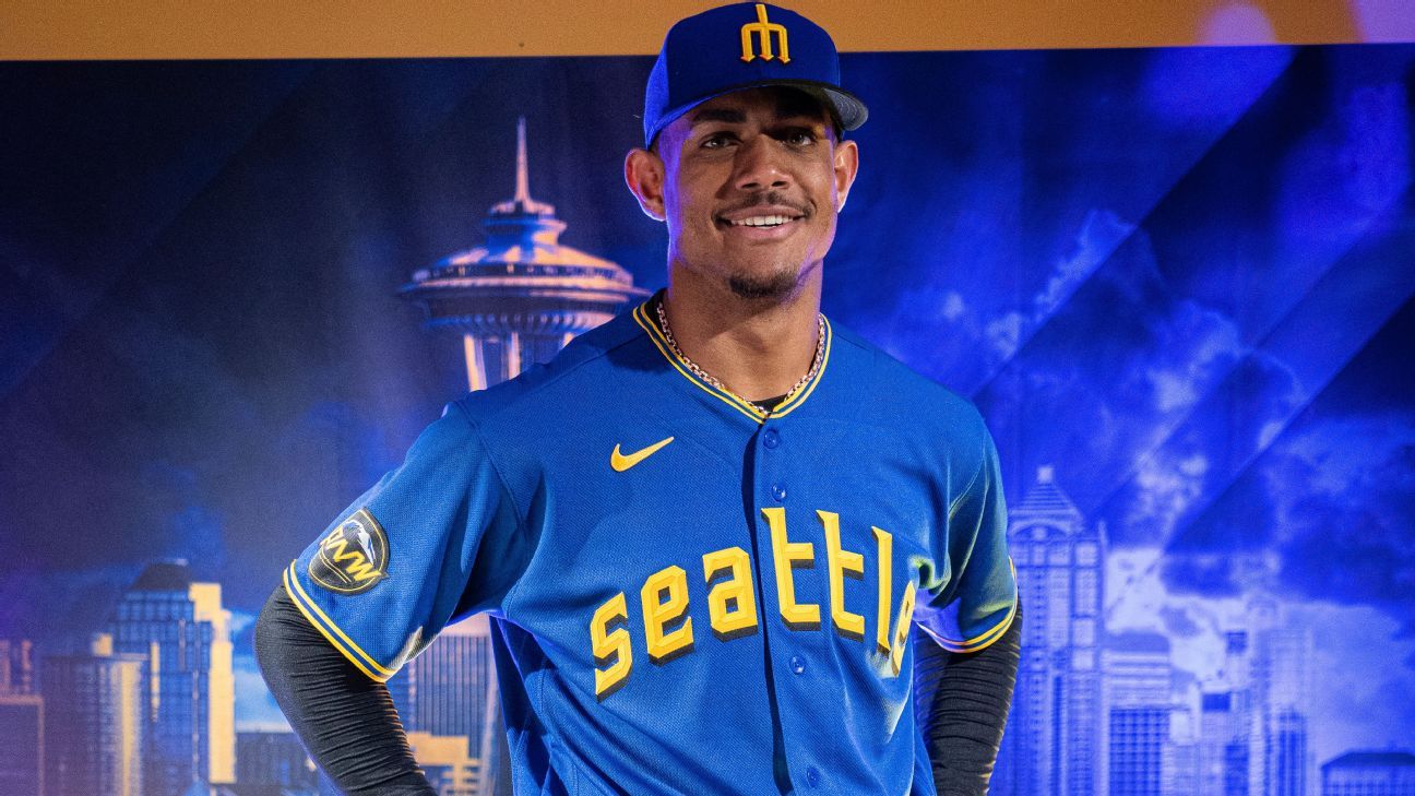
The Seattle Mariners unveiled their City Connect uniforms, channeling a throwback vibe with the return of the trident logo. The design pays homage to the history of baseball in the city with nods to the Pilots and the Steelheads.
“We really set out to create a bold, clean, forceful modern look,” Mariners senior vice president of marketing Kevin Martinez said. “… We pushed this in a direction to create a striking look that fits the identity of this team.”
The cap features a blue crown and a black visor, the first time the color combination has been used in Seattle baseball history. The trident logo has been a source of controversy in the past because of the team’s lack of success when their uniforms have featured it. In 1987, then-Mariners owner George Argyros changed the logo because of the superstition that an upside-down trident angers the ancient Greek god Poseidon, the ruler of the sea.
When the trident logo was prominent on Mariners uniforms, the team never finished with more than 76 wins in a season. Following the logo change, the Mariners won 78 games in 1987 and drafted Ken Griffey Jr. The team tallied its first winning season in 1991, made the postseason in 1995, and tied the MLB record for wins in a single season in 2001 — all without the trident. The team brought back in the look in the late 2010s, but also struggled with the trident in the rotation.
The Mariners also recently introduced a trident as a home run celebration prop, a decision made by the players independent of the introduction of the City Connect uniforms. Martinez hopes the return of the trident on City Connect wipes the slate clean.
“There’s a lot of love for the trident here,” Martinez said. “We’ve listened to our fans and if you come to a ballgame here, you’ll see it everywhere.”
Across the front of the jersey is “Seattle” written with a similar font to the Seattle Pilots, the original MLB team in the city that played one season in 1969. The typeface also features a drop shadow used by the Seattle Rainiers, a minor league team that won the Pacific Coast League championship in 1955.
The uniform features two phrases, the first being “Sodo Mojo” in reference to the neighborhood where the Mariners play. Additionally, “My oh my” appears on the jock tag, a reference to Hall of Fame broadcaster Dave Niehaus’ iconic phrase.
The sleeve features a patch dedicated to the Pacific Northwest, featuring Mount Rainier, PNW lettering and leaf embellishments meant to evoke the bills of the Pilots caps.
“It’s a celebration of 100 years of Seattle baseball,” Martinez said. “We have such a young, dynamic team and it really gives them their own identity as we move into a new era of Mariners baseball.”
