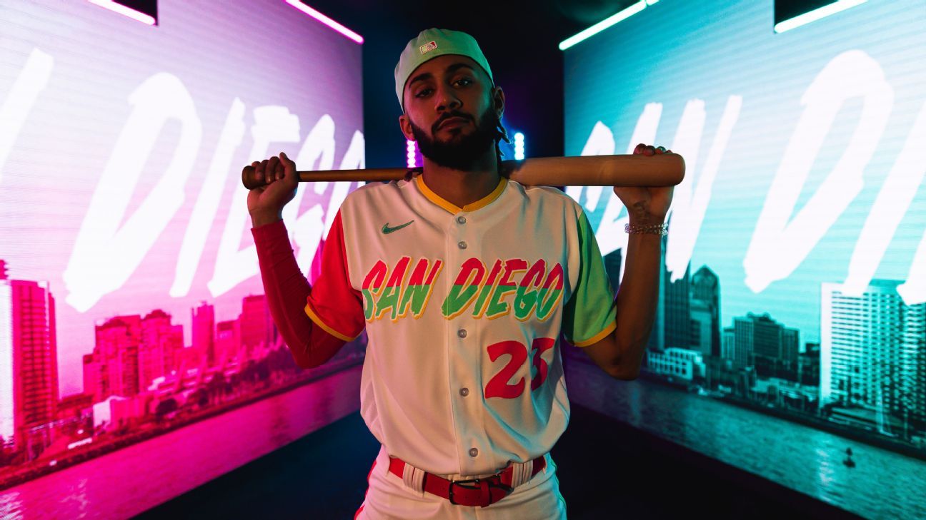
The San Diego Padres ‘ collaboration with Nike on City Connect uniforms began about 18 months ago and took several divergent paths. Most of them, Padres CEO Erik Greupner said, represented safer, more conventional options.
Ultimately, though, they went bold.
The Padres created a binational theme that pays homage to the Hispanic culture prevalent in a city close to the border shared by Mexico and the United States. They accentuated pink, mint and yellow, vibrant colors seen throughout the Baja peninsula, on a uniform that pays homage to a region with unique social dynamics.
“I think this will be really well received by a young and diverse fan,” Greupner said to ESPN in a phone conversation. “We really view this as an opportunity to connect in a deeper and more meaningful way with young and diverse fans.”
The Padres unveiled their City Connect uniforms on Friday, making them available through Nike’s website, Major League Baseball’s online shop and the Padres’ team store at Petco Park. The players will wear them for the first time on July 8, at home against the division rival San Francisco Giants, and for every Friday home game thereafter.
The Padres are the seventh and final team to unveil City Connect gear this season, following the Colorado Rockies, Houston Astros, Kansas City Royals, Los Angeles Angels, Milwaukee Brewers and Washington Nationals, each of whom attempted to capture the vibes of their surroundings through styles that deviated from their traditional uniforms.
It has been estimated that somewhere in the neighborhood of 100,000 people commute each day between San Diego and Tijuana, Mexico’s populous border city, riding buses, trolleys and cars to live and work. The result is a shared culture between Hispanics and Americans that might only be rivaled by Miami’s close ties with the Caribbean. The Padres attempted to honor that with three colors that, according to the team’s release, “mixes iconic California imagery with the vibrant colors of the Baja peninsula.”
Yellow forms the collar, lines the sleeves and outlines the namesake on the front, which is written in a font aimed to depict weathered beach signs. Pink is featured on the right sleeve, the number and the belt. Mint makes up the left sleeve and the cap.
The Padres, dormant for the majority of their 50-plus-year existence, have undergone a major transformation in recent years. They invested a combined $444 million on Eric Hosmer and Manny Machado in back-to-back offseasons, traded for established starting pitchers such as Yu Darvish, Blake Snell, Mike Clevinger, Joe Musgrove and Sean Manaea, capitalized on a star-laden farm system headlined by Fernando Tatis Jr. and watched their popularity soar in a city reeling from the departure of its NFL team.
The Padres are averaging 36,551 fans at Petco Park this season, fourth-most in the majors, and have experienced the industry’s biggest attendance growth since 2019, barely edging out an Atlanta Braves team that won last year’s World Series. These uniforms, they hope, will be another step towards connecting with a community that has rallied around the local baseball team ever since the Chargers moved to L.A.
The players, at least, are on board.
The team conducted a photo shoot with their City Connect uniforms during spring training, and Greupner immediately noticed a heightened energy through it.
“It’s kind of a vibe to put those on,” he said. “We’ve got a good portion of our roster that’s from Latin America and the Caribbean, and these colors are certainly evocative of that culture as well. That wasn’t the reason we picked them, but if you look at some of the accents that players across Major League Baseball, but in particular on the Padres have been wearing for the last couple years on their uniform — it’s been gold belts, gold cleats, it’s been pink, a lot of pink, it’s been this mint green color. And so we’ve created a uniform that sort of reflects a lot of colors that have been very meaningful in Hispanic culture, and as a result, not surprisingly, very meaningful here in San Diego.”
